
How to Make a YouTube Thumbnail More Eye-Catching
Learn how to make a YouTube thumbnail more eye-catching with better colors, text, contrast, composition, faces, branding, and simple design techniques.
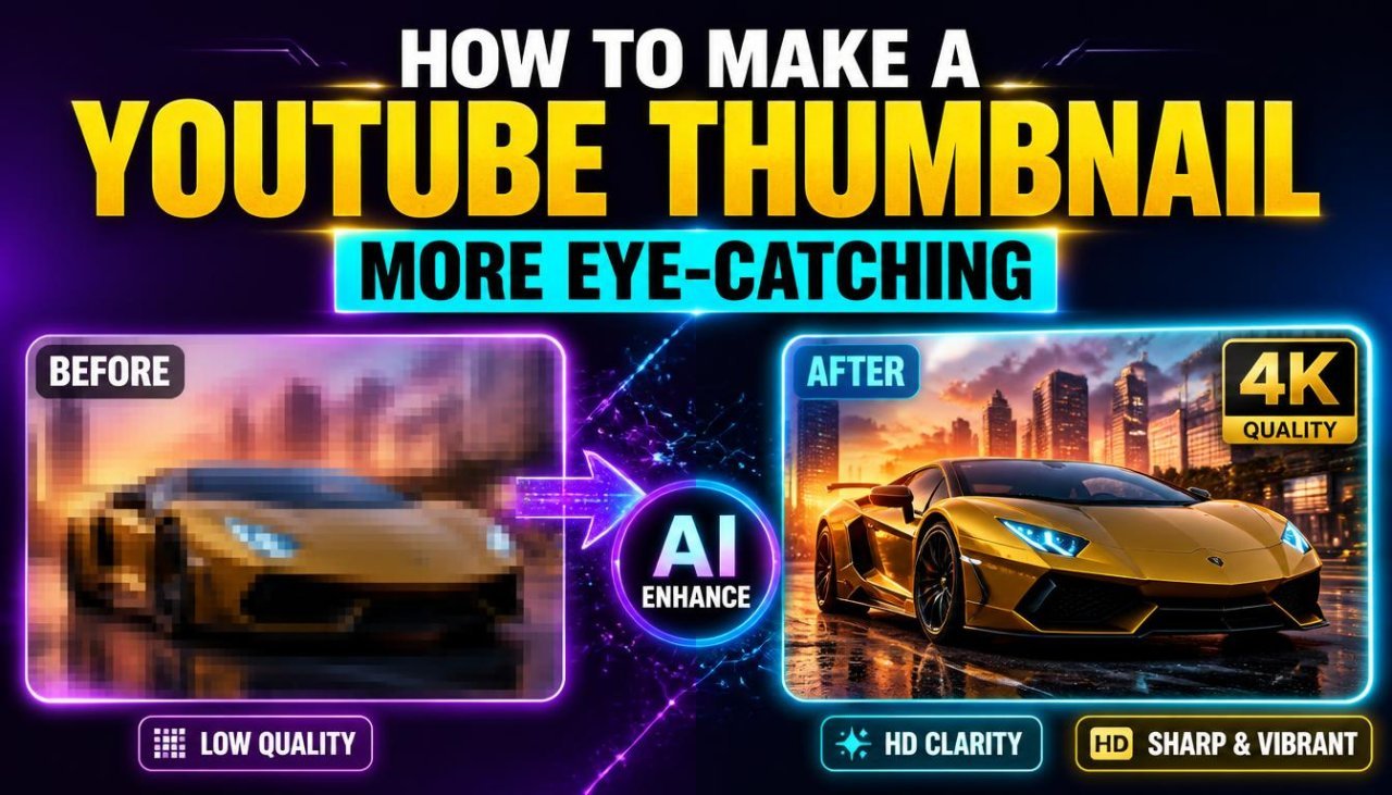
How to Make a YouTube Thumbnail More Eye-Catching
A YouTube thumbnail has a simple job: make someone notice your video and understand what it is about quickly.
When viewers are scrolling through YouTube, they may see dozens of thumbnails competing for attention. A thumbnail that is difficult to read, cluttered, dull, or unrelated to the video can easily be overlooked.
If you want to learn how to make a YouTube thumbnail more eye-catching, you don't need to fill the design with bright colors, huge text, or dozens of effects.
A better approach is to create a thumbnail with a clear subject, strong visual contrast, readable text, and a design that matches the video's actual content.
This guide explains practical ways to improve a YouTube thumbnail, even if you're a beginner.
Why Your YouTube Thumbnail Matters
Your thumbnail is one of the first visual elements viewers can notice when browsing YouTube.
It appears alongside other videos in places such as:
- YouTube search results
- Home recommendations
- Suggested videos
- Subscription feeds
- Channel pages
- Playlists and other browsing areas
- All Tools
A thumbnail cannot guarantee that someone will click your video. The video's topic, title, audience, competition, and viewer interest also matter.
However, a well-designed thumbnail can make the subject easier to understand and help your video stand out visually.
The best thumbnails don't simply try to grab attention.
They communicate a reason to look.
What Makes a YouTube Thumbnail Eye-Catching?
An effective thumbnail usually has a clear visual hierarchy.
That means the viewer can quickly understand:
- What is the main subject?
- What is happening?
- Why might this video be interesting?
Several design elements can help:
| Element | Purpose |
|---|---|
| Strong subject | Gives viewers something specific to notice |
| Contrast | Separates important elements |
| Short text | Communicates the main idea |
| Good composition | Prevents the design from feeling crowded |
| Color | Creates visual separation and mood |
| Facial expression | Can communicate emotion quickly |
| Consistent branding | Helps viewers recognize your channel |
| Clean background | Keeps attention on the main subject |
You don't need to use all of these elements in every thumbnail.
The goal is to choose the elements that support your particular video.
1. Choose One Main Subject
One of the easiest ways to improve a thumbnail is to give it a clear focal point.
A focal point is the element you want viewers to notice first.
For example, a technology video might focus on:
- A smartphone
- A laptop
- A new gadget
- A comparison between two products
A cooking video might focus on:
- The finished dish
- A key ingredient
- A cooking step
A tutorial might focus on:
- The result
- A relevant tool
- A before-and-after comparison
Try not to give every element equal visual importance.
If everything is large, colorful, and heavily edited, nothing feels particularly important.
2. Keep the Thumbnail Simple
More design elements don't automatically make a thumbnail more interesting.
A crowded thumbnail may contain:
- Too many photographs
- Multiple text blocks
- Several arrows
- Decorative icons
- Excessive shadows
- Too many colors
- Unnecessary backgrounds
This can make the main message difficult to understand.
Instead, remove anything that doesn't support the video's central idea.
A useful beginner test is:
Can you understand the basic idea of the thumbnail within a quick glance?
If not, simplify it.
3. Use Large, Readable Text
Text can be useful when it adds information that the image alone cannot communicate.
However, thumbnail text should generally be short.
Instead of writing:
"Here Are the Best Ways to Improve Your YouTube Thumbnail Design"
you could use something more concise, such as:
"BETTER THUMBNAILS"
or:
"FIX THIS!"
The exact wording should depend on the video's actual content.
Keep Text Easy to Read
Use:
- A clear font
- Strong contrast
- Adequate spacing
- A sensible font size
- A simple text arrangement
Avoid putting important text over a busy section of the image.
Remember that thumbnails are often displayed much smaller than the original design canvas.
4. Create Strong Contrast
Contrast helps separate one element from another.
For example:
- Light text on a dark area
- Dark text on a light area
- A bright product against a muted background
- A person separated clearly from the background
You can create contrast through:
- Color
- Brightness
- Size
- Position
- Shape
- Detail
You don't need extreme colors to create contrast.
Sometimes a relatively simple background makes the subject stand out more effectively than a complicated design.
5. Use Colors With a Purpose
Color can influence how quickly a thumbnail catches the eye.
But using every bright color at once can make the design look messy.
A simple color strategy is often easier to manage.
For example, you might use:
- One dominant background color
- One accent color
- One text color
The exact palette should match your content and branding.
For a professional channel, consistent colors can help create recognizable thumbnails.
For entertainment content, stronger color combinations may suit the subject.
The important thing is not simply making the thumbnail colorful.
Use color to separate important elements and guide attention.
6. Make the Subject Stand Out From the Background
A subject can disappear when its colors or tones are too similar to the background.
For example, a person wearing a dark shirt against a dark background may not be immediately noticeable.
You can improve separation by:
- Using a simpler background
- Increasing contrast
- Changing the subject's position
- Adding subtle separation effects
- Adjusting brightness
- Creating more empty space around the subject
A clean background can be especially useful when the main subject contains important details.
7. Use Faces and Expressions When They Fit the Content
Faces can communicate emotion quickly.
A thumbnail featuring a person might use an expression that matches the video's actual topic, such as:
- Surprise
- Excitement
- Curiosity
- Concern
- Happiness
- Concentration
However, exaggerated expressions should not be added simply because they are popular.
The expression should make sense for the video.
For educational or professional channels, a natural expression may be more appropriate.
For entertainment content, a more expressive presentation may fit the channel better.
8. Use the Rule of Visual Hierarchy
Visual hierarchy determines the order in which viewers notice elements.
A simple thumbnail might have this hierarchy:
1. Main subject → 2. Short text → 3. Supporting detail
For example, imagine a thumbnail for a smartphone comparison.
The phone could be the largest element.
A short phrase such as:
"WHICH WINS?"
could be the second visual point.
Small supporting details can remain in the background.
This is usually easier to understand than giving equal size and emphasis to every element.
9. Don't Put Everything in the Thumbnail
Your thumbnail doesn't need to explain the entire video.
That's what the video itself is for.
Instead, the thumbnail can communicate one strong idea.
For example:
Video topic: Complete guide to editing photos on a smartphone.
Possible thumbnail concept:
Phone + edited photo + "BEFORE / AFTER"
You don't need to list every editing feature in the thumbnail.
Keeping some information for the title and video can make the overall presentation cleaner.
Thumbnail Text vs. Video Title
Your title and thumbnail should work together rather than simply repeating each other.
For example:
| Video Title | Thumbnail Text |
|---|---|
| How to Edit Photos on Your Phone | BETTER PHOTOS |
| How I Built My First Website | FROM ZERO |
| Best Budget Camera Settings | USE THESE |
| How to Clean a Laptop Safely | CLEAN IT RIGHT |
| YouTube Thumbnail Design Guide | MAKE IT STAND OUT |
The thumbnail can reinforce the topic while adding a different visual angle.
Avoid making the thumbnail text so vague that viewers can't understand the subject.
10. Use Before-and-After Designs
Before-and-after layouts can work particularly well when the video demonstrates a visible transformation.
They may be useful for:
- Photo editing
- Home improvements
- Graphic design
- Fitness-related transformations
- Cleaning
- Makeovers
- Restoration
- Image enhancement
A simple split layout can communicate the transformation quickly.
For example:
BEFORE | AFTER
The important thing is that the difference should be genuine and related to the video.
Don't exaggerate the result just to make the thumbnail appear more dramatic.
11. Use Arrows, Circles, and Highlights Carefully
Arrows and circles can direct attention toward a specific detail.
They can be useful when:
- A small object is important
- You are pointing out a specific change
- The subject needs additional visual guidance
But adding several arrows and circles can make the design feel cluttered.
Use them only when they serve a clear purpose.
If the viewer already knows where to look, the extra graphic may not be necessary.
12. Think About Mobile Viewing
Many people encounter YouTube content on relatively small screens.
This means a thumbnail that looks excellent on a large monitor may become difficult to understand when displayed smaller.
Before publishing, reduce the thumbnail to a smaller preview and ask:
- Can I still identify the main subject?
- Can I read the important text?
- Is the background too busy?
- Does the main idea remain obvious?
- Are small details actually necessary?
If the thumbnail stops working when reduced in size, simplify the design.
13. Match the Thumbnail to the Video
An eye-catching thumbnail should accurately represent the video.
Avoid creating a visual promise that the video doesn't deliver.
For example, if a video compares two products, the thumbnail should not imply that a completely different product was tested.
A strong thumbnail attracts the right viewer by communicating the actual subject clearly.
This is better for long-term audience trust than relying on misleading imagery.
Beginner-Friendly Thumbnail Formula
If you're creating thumbnails for the first time, start with a simple formula:
One main subject + short text + strong contrast + clean background
For example:
[Large product] + [2–4 word message] + [simple background]
You can then add one supporting element if it genuinely improves the design.
This gives you a useful starting point without requiring advanced graphic-design skills.
Quick Eye-Catching Thumbnail Checklist
Before publishing your thumbnail, check:
- Is there one clear main subject?
- Can the thumbnail be understood quickly?
- Is the text short and readable?
- Does the subject stand out from the background?
- Is the contrast strong enough?
- Are the colors working together?
- Is the design too crowded?
- Does it still work at a small size?
- Does it accurately represent the video?
- Does the thumbnail work together with the title?
If you can answer yes to most of these questions, you already have a strong foundation for a more eye-catching YouTube thumbnail.
Advanced Ways to Make a YouTube Thumbnail More Eye-Catching
Once the basic design is in place, you can improve your thumbnail by thinking more carefully about attention, hierarchy, context, and consistency.
An advanced thumbnail is not necessarily more complicated. In many cases, it is actually simpler because every visual element has a specific purpose.
Before adding another effect, ask:
Does this element help the viewer understand the video or notice the main subject?
If the answer is no, remove it.
1. Create a Clear Visual Story
A strong thumbnail can communicate a simple story without explaining everything.
For example, a thumbnail for a video about testing an expensive camera could show:
Camera + creator's reaction + short phrase
The viewer can immediately understand that the camera is being tested and that the creator has an opinion about it.
For a tutorial, you might show:
Problem → Result
For a comparison:
Product A ↔ Product B
For a challenge:
Creator + challenge object + emotional reaction
The thumbnail should create enough context to make the subject understandable without becoming a miniature version of the entire video.
2. Use the Background to Support the Subject
The background should support the main subject rather than compete with it.
A busy photograph can sometimes work as a background, but important foreground elements may become difficult to see.
You can create separation by:
- Blurring an unnecessary background
- Darkening distracting areas
- Removing clutter
- Simplifying the scene
- Adding empty space
- Using a subtle gradient
- Moving the subject away from busy areas
The goal is not to make every background completely plain.
The goal is to make sure the viewer knows where to look first.
3. Use Depth to Make Elements Easier to Notice
You can create a sense of depth by separating foreground, middle-ground, and background elements.
For example:
Background: simple environment
Middle: supporting object
Foreground: main person or product
Subtle shadows, separation, and scale differences can help create this effect.
Avoid adding heavy effects simply because they are available.
A small amount of separation can be enough to make the main subject stand out.
4. Use Thumbnail Contrast Strategically
Contrast isn't limited to color.
You can create contrast through:
Size
A large main subject next to smaller supporting elements.
Brightness
A brighter subject against a darker background.
Color
A distinctive accent color against a quieter surrounding palette.
Detail
A detailed foreground object against a simpler background.
Shape
A recognizable object against an uncluttered area.
Using several types of contrast together can create a stronger visual hierarchy without adding lots of decorative elements.
5. Design for Recognition at a Small Size
One of the best ways to test a thumbnail is to view it much smaller than your editing canvas.
At a reduced size, tiny details disappear.
That's useful because it reveals whether your main idea is strong enough.
If your thumbnail still communicates the subject when reduced, your hierarchy is probably working.
If everything becomes a collection of tiny shapes and unreadable text, simplify it.
Small-Size Test
Try viewing your finished thumbnail as a small preview.
Check:
- Main subject
- Text
- Contrast
- Facial expression
- Product shape
- Major colors
- Overall composition
Don't spend too much time perfecting details that viewers may never notice.
6. Use the Rule of Thirds as a Starting Point
The rule of thirds is a common composition technique that divides an image into nine sections.
You can use the intersections of these sections as approximate positions for important elements.
For example, you might place:
- A person's face toward one side
- A product toward another side
- Text in the remaining open area
This can create a balanced composition.
However, it is not a strict rule.
If placing the subject in the center creates a stronger thumbnail, use the center.
The viewer's understanding of the thumbnail matters more than following a design rule mechanically.
7. Use Faces When They Add Meaning
A face can make a thumbnail feel more personal and can communicate an emotional reaction quickly.
But adding a face to every thumbnail is not necessary.
A face makes more sense when the creator is part of the video's story.
For example:
- Reviewing a product
- Sharing a personal experience
- Reacting to an event
- Explaining a mistake
- Taking part in a challenge
If the video is primarily about an object, tutorial, or screen recording, the main subject may be more useful than a person's face.
Choose the visual element that best represents the video.
8. Make Thumbnail Text Complement the Title
One of the most useful advanced techniques is to make the title and thumbnail work as a pair.
Instead of repeating the exact same sentence, give each one a different job.
Example
Title:
How to Make Better YouTube Thumbnails for Your Channel
Thumbnail:
MAKE IT STAND OUT
The title explains the topic.
The thumbnail provides a short visual message.
Another example:
Title:
I Tested 5 Budget Microphones for YouTube
Thumbnail:
WHICH ONE WINS?
This creates a relationship between the two elements without simply copying the title.
9. Use Numbers When They Actually Matter
Numbers can make a thumbnail easy to understand when they are genuinely relevant to the video.
Examples include:
- "3 MISTAKES"
- "5 TESTS"
- "7 TOOLS"
- "30 DAYS"
- "₹999"
However, don't add a number just to make the design look more interesting.
The number should correspond to something the video actually covers.
Accuracy matters more than decoration.
10. Use Consistent Branding
If you're building a YouTube channel, your thumbnails should eventually become recognizable as a group.
You can create consistency through:
- Similar typography
- A recurring accent color
- Consistent logo placement
- Similar framing
- Repeated design patterns
- Consistent subject positioning
This doesn't mean every thumbnail should look identical.
A better approach is to create a recognizable visual system while allowing each video to have its own design.
For example, one channel might consistently use a specific font and accent color while changing the background and main subject for every video.
Comparison: Simple vs. Overdesigned Thumbnail
| Simple Thumbnail | Overdesigned Thumbnail |
|---|---|
| One main subject | Many competing subjects |
| Short text | Long paragraphs |
| Clear contrast | Too many colors |
| Clean background | Distracting background |
| Limited effects | Excessive effects |
| Clear hierarchy | Everything has equal emphasis |
| Easy to understand | Difficult to understand quickly |
A simple thumbnail isn't automatically better.
The real goal is clarity with visual interest.
Pros and Cons of Different Thumbnail Styles
| Thumbnail Style | Pros | Cons |
|---|---|---|
| Face-focused | Personal and expressive | Less useful for some topics |
| Product-focused | Clear subject | Can feel plain without good composition |
| Text-focused | Message is obvious | Can become crowded |
| Before-and-after | Shows transformation | Requires a genuine visual difference |
| Minimalist | Clean and easy to understand | May look less dramatic |
| Bold/colorful | Can stand out visually | Can become overwhelming |
| Screenshot-based | Useful for tutorials | Small details may disappear |
The right style depends on the video topic, audience, and channel.
Pros of Using a Strong Thumbnail Design
A well-designed thumbnail can:
- Make the topic easier to understand.
- Give the video a professional appearance.
- Help distinguish your video from visually similar content.
- Establish consistent channel branding.
- Highlight the most important part of the video.
- Improve readability at smaller sizes.
- Create a stronger connection between the title and visual presentation.
However, thumbnail design is only one part of a video's overall presentation.
Cons of Over-Optimizing a Thumbnail
Trying too hard to make a thumbnail eye-catching can create new problems.
You may end up with:
- Misleading visuals
- Excessive text
- Too many effects
- Artificial facial expressions
- Unnecessary arrows
- Extreme color combinations
- A design that doesn't match your channel
- A thumbnail that promises something the video doesn't deliver
A thumbnail should attract attention for the right reason.
If the viewer clicks because they expect something that isn't in the video, the design is working against audience trust.
Common Thumbnail Mistakes
Mistake 1: Too Much Text
A thumbnail isn't a blog post.
Keep the message short.
Mistake 2: Tiny Text
Text that looks readable in your design software may become unreadable in a small YouTube preview.
Mistake 3: Too Many Objects
Multiple products, people, icons, arrows, and backgrounds can compete for attention.
Mistake 4: Weak Contrast
If the text blends into the background, viewers may not notice it.
Mistake 5: Random Effects
Glow, shadows, outlines, and filters should have a purpose.
Mistake 6: Copying Another Creator's Style
Study successful design principles, but develop a visual identity that fits your own channel.
Mistake 7: Misleading the Viewer
Don't show something dramatically different from what the video actually contains.
Mistake 8: Ignoring the Title
The thumbnail and title should be designed together.
Mistake 9: Forgetting Mobile Viewing
A detailed design can lose its impact when displayed at a smaller size.
Mistake 10: Never Testing New Designs
Your audience may respond differently to different visual approaches. Review your own performance data and learn which styles work for your channel.
Best Practices for Eye-Catching YouTube Thumbnails
Use these practices as a repeatable workflow:
- Start with one clear idea.
- Choose one dominant subject.
- Keep the background controlled.
- Use short, readable text.
- Create strong separation between elements.
- Use color intentionally.
- Make important elements large enough to recognize.
- Match the visual to the video's actual content.
- Design the thumbnail and title as a pair.
- Check the thumbnail at a small size.
- Maintain consistent branding across your channel.
- Remove unnecessary elements before publishing.
- Keep the original design file for future edits.
- Compare new designs with your previous thumbnails.
- Use real audience data to improve your future designs.
A Practical Thumbnail Creation Workflow
Here's a repeatable process you can use for almost any YouTube video.
Step 1: Identify the Video's Main Idea
Write the video's central idea in one short sentence.
Step 2: Choose the Main Visual
Select the person, product, result, or scene that represents that idea.
Step 3: Remove Unnecessary Background Elements
Make the main subject easier to recognize.
Step 4: Add Supporting Text
Use a short phrase only if it adds useful context.
Step 5: Establish Contrast
Make sure the subject and text are separated from the background.
Step 6: Check Composition
Look for empty space, balance, and a clear focal point.
Step 7: Reduce the Thumbnail
View it at a smaller size.
Step 8: Remove Anything Unnecessary
If an element doesn't improve understanding or attention, consider removing it.
Step 9: Compare With the Title
Make sure the two elements complement each other.
Step 10: Review for Accuracy
Ask whether the thumbnail honestly represents the video.
Step 11: Export the Final Design
Use the required thumbnail dimensions and an appropriate image format.
This process is simple enough for beginners but gives you room to improve as your design skills develop.
Conclusion
Learning how to make a YouTube thumbnail more eye-catching is less about adding more effects and more about making the right elements easy to notice.
A strong thumbnail usually has a clear subject, readable text, useful contrast, balanced composition, and a visual connection to the video's topic.
Start with one main idea. Choose a strong image or subject, remove distracting elements, and use short text only when it adds value. Then check the design at a small size because viewers may see your thumbnail as a relatively small preview while browsing.
Remember that an eye-catching thumbnail should still be honest. It should create interest without making a promise that the video cannot deliver.
A simple workflow can make the process easier:
Choose the main idea → Select the main subject → Simplify the background → Add short text → Improve contrast → Check composition → Test at a small size → Compare with the title → Review for accuracy → Publish
You don't need advanced graphic-design skills to start. With practice, consistent branding, and careful review of your own results, you can gradually create thumbnails that are clearer, more attractive, and better suited to your audience.
Call To Action
Ready to improve your next YouTube thumbnail?
Start with your video's main idea and choose one strong visual that represents it. Add a short message only if it helps explain the topic, then improve the contrast and remove anything that distracts from the main subject.
Before publishing, view the thumbnail at a smaller size and make sure it still communicates the video's idea clearly.
Create a simple, honest, and eye-catching thumbnail that gives viewers a clear reason to learn more about your video.
1. How do I make a YouTube thumbnail more eye-catching?
Use one clear subject, short readable text, strong contrast, a clean background, and a simple composition. Make the most important element visually dominant and remove anything that distracts from the main idea.
2. What makes a YouTube thumbnail stand out?
A clear focal point, strong visual contrast, readable text, relevant imagery, and a balanced composition can help a thumbnail stand out. The design should also match the video's actual topic.
3. How much text should I put on a YouTube thumbnail?
Keep thumbnail text short enough to read quickly. Instead of placing the entire video title on the thumbnail, use a brief phrase that adds context or creates curiosity while accurately representing the video.
4. What colors are best for YouTube thumbnails?
There is no single color combination that works for every channel. Choose colors that create enough contrast between the subject, background, and text. Consistent colors can also help establish channel branding.
5. Should I use a face in my YouTube thumbnail?
A face can be useful when the creator's reaction or personality is relevant to the video. However, it is not necessary for every thumbnail. For product, tutorial, or object-focused videos, the main subject may be more useful.
6. Should a YouTube thumbnail have a lot of effects?
No. Excessive shadows, glows, arrows, outlines, and other effects can make a thumbnail difficult to understand. Use visual effects only when they improve separation, emphasis, or clarity.
7. How can I make my thumbnail readable on mobile?
Use large, simple text, a strong contrast between text and background, and a clear main subject. Reduce the thumbnail to a small preview before publishing to check whether the important elements remain visible.
8. Should the thumbnail repeat the YouTube title?
The thumbnail does not need to repeat the title word for word. A better approach is often to make the thumbnail and title complement each other, with the title explaining the topic and the thumbnail providing a short visual message.
9. Can an eye-catching thumbnail be misleading?
Yes. A thumbnail can become misleading when it shows something that isn't actually included in the video or creates an inaccurate impression. An effective thumbnail should attract viewers while honestly representing the content.
10. How can I improve my YouTube thumbnail design over time?
Create thumbnails consistently, compare your designs, study which visual approaches fit your audience, and use your available channel performance data to guide future experiments. Focus on clarity and relevance rather than copying trends blindly.
Ready to optimize your images?
Every tool mentioned in this article is free to use. No upload, no signup, and no watermarks — ever.
Try our free toolsRelated articles
How to Make a YouTube Thumbnail Look Professional Online
Learn how to make a YouTube thumbnail look professional online with better layouts, images, text, colors, branding, and simple design techniques.
How to Restore an Old Photo With AI: Complete Beginner's Guide
Learn how to restore an old photo with AI by repairing damage, improving clarity, reducing noise, and bringing faded photographs back to life with simple techniques.
How to Remove a Person From a Photo With AI: Easy Online Guide
Learn how to remove a person from a photo with AI using simple online editing techniques. Discover how AI object removal works, when to use it, and how to get natural-looking results.