
Top 7 Photo Editing Styles Trending in 2026
From soft film grain to AI-blended hyperreal — these are the editing aesthetics dominating Instagram, Pinterest, and fashion campaigns this year.
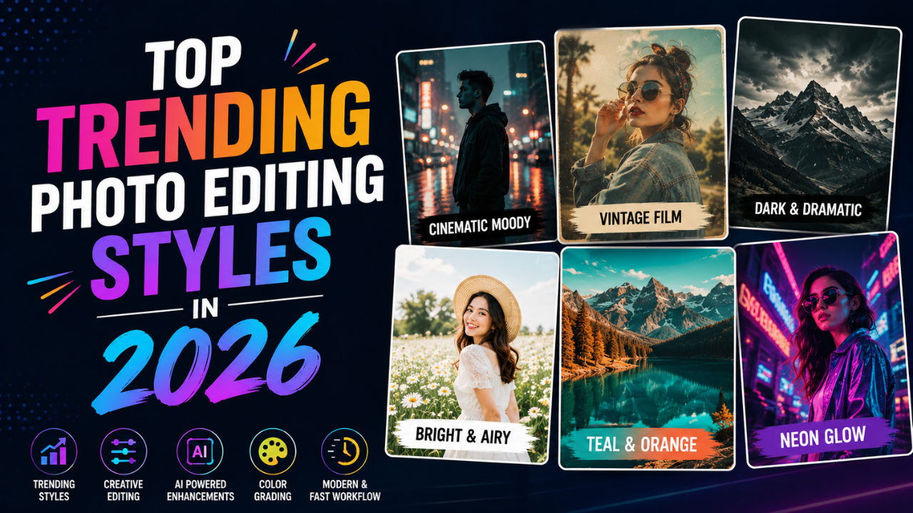
Photo aesthetics cycle in 5-7 year waves. The 2017 "rose gold + light leaks" look was as dated by 2022 as the 1995 "black-and-white with one colour" was by 2002.
Here's what's actually dominant in 2026 — based on what major brands, top creators, and editorial publications are publishing right now.
1. Soft film grain (Kodak / Portra revival)
What it is: subtle film-style grain added to digital photos, with slightly desaturated colours and softer highlights.
The look mimics Kodak Portra 400 or Fuji Pro 400H film. Skin tones are warm, shadows have a gentle softness, and there's a layer of fine grain that adds texture without being distracting.
Where it's used:
- Fashion editorials
- Wedding photography (heavy reliance)
- "Authentic" lifestyle brand content
- Indie creator portraits
How to fake it digitally:
- Reduce saturation 8-12%
- Slight warm tint (+5 temperature)
- Highlights pulled down slightly
- Grain plugin/preset (Lightroom Grain panel, free presets online)
- Soft contrast curve (gentle S-shape, not aggressive)
2. AI hyperreal / cinematic
What it is: highly detailed, almost-too-perfect photos that look like high-budget commercial shots. Driven by AI generation and AI enhancement.
Characteristics:
- Crisp detail throughout
- Dramatic lighting (often three-point studio lighting feel)
- Slight halos around subjects (subtle, not the bad HDR kind)
- Skin retouched but not plastic
- Cinematic colour grading (often teal-and-orange)
Where it's used:
- Tech and SaaS marketing
- Premium product launches
- Music album covers
- AI-generated brand content
How to achieve:
- AI upscale your best photos (2× clean)
- Apply teal-orange colour grade preset
- Add subtle vignette + atmospheric haze
- Slight glow effect on highlights (5-10% strength)
3. Soft neutrals + matte finish
What it is: warm cream, beige, and muted tones with a flat (matte) tonal range. Black is never pure black; whites are slightly off-white.
Where it's used:
- Wellness brands
- Lifestyle bloggers
- Architectural photography
- Minimalist Instagram feeds
How to fake it:
- Lift shadows significantly (so blacks become dark grey)
- Pull highlights down slightly
- Mute saturation 15-20%
- Add cream tone to shadows
- The "matte preset" pack is everywhere — most editing apps have one
4. Bold colour blocking
What it is: photos where 1-2 strong colours dominate. Either through real subjects (red dress, yellow wall) or through colour grading that pushes one channel hard.
Where it's used:
- Fashion campaigns
- Editorial covers
- Modern advertising (especially banking, fintech)
How to achieve:
- Shoot or find subjects with strong colour against neutral backgrounds
- Boost the dominant colour's saturation (carefully — see beginner mistakes guide)
- Mute everything else (selective desaturation)
- Crop tightly to the colour-block subject
5. Vintage analog (90s digital, low-fi)
What it is: imitating digital camera looks from 1998-2008 — slightly overexposed, blown highlights, soft focus, occasional dust or scratch overlays.
Where it's used:
- Gen Z content creators
- Music industry
- "Authentic" brand content (Wendy's-style, Liquid Death)
- Y2K nostalgia content
How to achieve:
- Use a low-quality JPG preset (paradoxically — quality 60 here is the point)
- Add film burn or light leak overlays
- Heavy desaturation
- Slight blue tint in shadows
- Resize down then back up to create that compressed feel
This is the opposite of "high-quality" — embrace it intentionally for the right brand.
6. Studio Ghibli / painted illustration
What it is: photos cartoonized in a Studio Ghibli, Disney, or Pixar style. Sometimes generated entirely with AI; sometimes a heavy filter over a real photo.
Where it's used:
- Personal projects, profile pics
- Kids' brands
- Soft / wholesome content
- Greeting cards
How to achieve:
- AI cartoonization tools (see our cartoon conversion guide)
- Or manual posterization + edge detection in Photopea / GIMP
- Soft pastel colour grading
- Watercolour texture overlays
Caveat: massively overused in 2024-2025. Use it intentionally or it'll feel dated.
7. Dark moody (cinematic shadows)
What it is: deep shadows, low-key lighting, dramatic contrast. Often used in editorial portraits and product shots.
Where it's used:
- Luxury fashion
- High-end product photography (watches, perfume)
- Magazine editorials
- Music industry
How to achieve:
- Drop shadows significantly
- Pull highlights down too (not just shadows)
- Boost contrast moderately
- Slight desaturation
- Vignette to draw eye to subject
- Cool tint in shadows (subtle blue)
This style is unforgiving — it requires sharp focus and intentional composition. Bad photos look worse moody, not better.
What's fading (avoid for new work)
- Bright HDR with halos — 2014 vibes, looks tacky
- Heavy Instagram filter stack (X-Pro II, Lo-Fi, Valencia) — 2012 nostalgia
- Pure black-and-white with one colour — dated since 2005
- Soft pastel grain alone — feels stuck in 2018
- VSCO A6 filter — was the look in 2017
- Tilt-shift on everything — was a fad in 2010
If your edits could be from 2010-2018, refresh them.
How to develop your own style
Don't copy a trend wholesale. Mix elements:
- Pick a base trend that feels right for your content (e.g. soft neutrals)
- Pick one element from a different trend (e.g. bold colour blocking when relevant)
- Stay consistent within the choice — don't randomly switch every post
The most recognisable creator feeds in 2026 all do this — pick a clear aesthetic, stick with it for at least 6 months, slowly evolve.
Common style mistakes
- Following all trends simultaneously — your feed looks confused
- Trying every trend before settling — paralysis. Pick one for 90 days.
- Copying without adapting — works for them, may not for your content
- Over-applying any one technique — moderation reads as taste
Trend-spotting in 2026
Where pros watch for what's next:
- Vogue / British Vogue covers
- W Magazine editorials
- TheCutDC, Highsnobiety social
- Pinterest's annual report ("Pinterest Predicts")
- Top 100 followed photographers on Instagram (filter by relevance, not just count)
Browse 50-100 high-quality recent photos in your niche, identify the common visual elements, those are the trends.
Apply to your work
For each photo you publish, ask:
- Does this match my established style?
- Does this match the platform's current aesthetic?
- Will this feel dated in 12 months?
The intersection of those three is where successful posts live.
For style-application workflow, our free image tools handle the technical side — crop, resize, compress, color extract — so you can focus on the creative decisions.
Ready to optimize your images?
Every tool mentioned in this article is free to use. No upload, no signup, and no watermarks — ever.
Try our free toolsRelated articles
10 Photo Editing Mistakes Every Beginner Makes (and How to Fix Them)
Over-sharpened skin, jacked-up saturation, the dreaded HDR halo — the mistakes beginners make are easy to spot once you know what to look for.
Best Color Combinations for Social Media Posts (Tested Across Platforms)
The right two colours can double a post's engagement. The wrong combination kills the scroll. Here are the palettes that consistently work — across Instagram, LinkedIn, Pinterest, and Twitter.

How Professional Designers Edit Images 10× Faster (Real Workflow Secrets)
The gap between amateur and pro editing isn't talent — it's workflow. Here's how working designers process 100+ images per day without burning out.