
How to Make a YouTube Thumbnail That Gets More Clicks
Learn how to make a YouTube thumbnail that gets more clicks with better design, readable text, strong visuals, color contrast, and simple thumbnail optimization techniques.
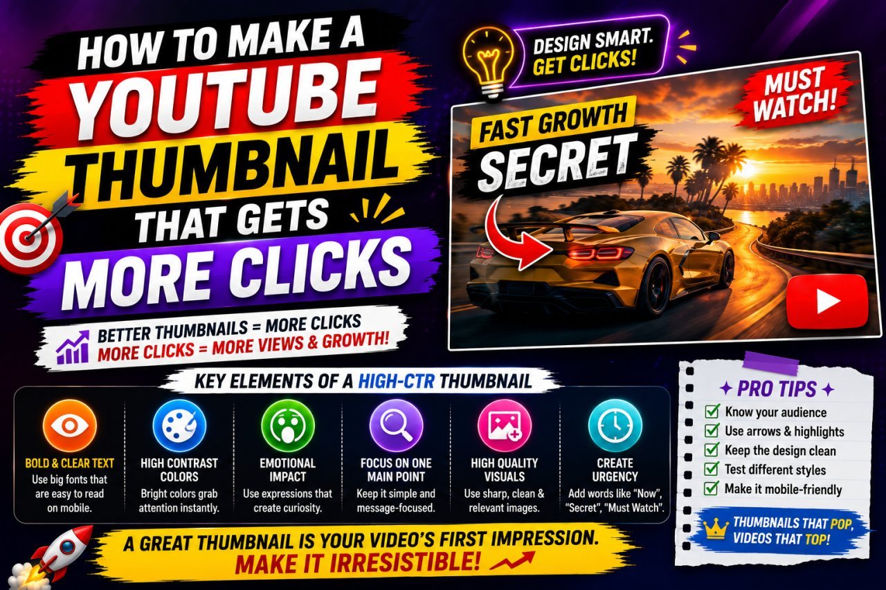
How to Make a YouTube Thumbnail That Gets More Clicks
Introduction
Your YouTube thumbnail has one important job: make someone interested enough to stop scrolling and consider watching your video.
A great video can still struggle to attract viewers if its thumbnail is confusing, difficult to read, or visually similar to everything around it.
Learning how to make a YouTube thumbnail that gets more clicks is therefore an important part of creating videos.
A good thumbnail does not need complicated graphics or expensive design software. In many cases, a simple image, a clear subject, a few carefully chosen words, and strong visual contrast can create a much better result.
The key is to make the thumbnail communicate the video's main idea quickly.
A viewer should be able to understand the basic promise of your video in just a moment.
Why Does a YouTube Thumbnail Matter?
When people browse YouTube, they see many videos competing for their attention.
The thumbnail is one of the first visual elements they notice.
Your title explains the topic, while the thumbnail can add visual context and create curiosity.
For example, imagine a video titled:
"I Tried Editing Photos on My Phone for 7 Days"
A weak thumbnail might simply show a random screenshot of a photo-editing app.
A stronger concept could show:
- A clear before-and-after image
- A visible facial reaction
- Very short supporting text
- A strong visual difference between the two sides
The second concept communicates the video's idea much faster.
A useful principle
Your thumbnail should make the video easier to understand, not harder.
Avoid filling it with unnecessary elements just because you have empty space.
What Makes a YouTube Thumbnail Clickable?
There is no guaranteed thumbnail formula that makes every video successful.
However, strong thumbnails commonly share several characteristics.
They are usually:
- Easy to understand
- Visually clear
- Relevant to the video
- Readable on small screens
- Focused on one main idea
- Visually different from nearby content
- Consistent with the video's actual content
The goal is not to trick viewers into clicking.
The goal is to present the video's value clearly enough that the right viewers want to watch it.
Start With the Video's Main Idea
Before designing the thumbnail, ask yourself:
What is the one thing I want viewers to notice?
This question can prevent a common design problem: trying to communicate everything at once.
For example, if your video is about testing five image-editing tools, your thumbnail does not need to display every tool.
Instead, you might focus on:
5 Tools → One Clear Result
Or:
Before → After
Or:
Best vs. Worst
The exact concept depends on the video.
One thumbnail = one main message
If viewers need several seconds to understand what the thumbnail is showing, the design may be too complicated.
Use a Strong Main Image
The main visual should immediately attract attention.
Depending on your content, this could be:
- A person's face
- A product
- A dramatic before-and-after
- A finished project
- A surprising result
- A relevant object
- A clear screenshot
Choose an image that supports the video's topic.
A random attractive image may get attention, but if it has nothing to do with the video, it can create the wrong expectation.
That can hurt the viewer experience.
Faces Can Add Personality
If your channel is built around a person, showing a face can help make the thumbnail feel more personal.
Facial expressions can communicate emotions such as:
- Surprise
- Excitement
- Confusion
- Happiness
- Concern
- Curiosity
However, a face is not mandatory.
A tutorial about software, photography, coding, finance, or products may work perfectly well with an object or visual result as the main focus.
The important thing is relevance.
Keep Thumbnail Text Short
One of the most common thumbnail mistakes is adding too much text.
Remember that viewers may see your thumbnail on a relatively small mobile screen.
A paragraph that looks readable in an image editor may become difficult to read once the thumbnail appears in YouTube recommendations.
Instead of writing:
"Here Are the Five Best Ways to Improve Your YouTube Thumbnail Design"
you might use something shorter, such as:
"5 THUMBNAIL FIXES"
or:
"MORE CLICKS?"
or:
"THIS WORKS"
The exact wording should support the video's actual topic.
A simple rule
Use the thumbnail to create visual interest, and let the title provide additional detail.
The two should work together instead of repeating exactly the same sentence.
Make Text Easy to Read
Readable text is more important than fancy typography.
When selecting a font, consider:
- Font size
- Weight
- Contrast
- Spacing
- Background
- Mobile readability
A bold, simple font is often easier to read than an elaborate decorative font.
If the background is busy, the text can disappear into it.
You can improve readability using:
- A contrasting color
- A subtle outline
- A shadow
- A darker or lighter background area
- A simple text box
Do not add effects just for decoration.
Every design element should help the viewer understand the thumbnail.
Use Strong Contrast
Contrast helps important elements stand out.
For example, dark text on a dark background can disappear.
Likewise, light text placed over a bright background may be difficult to read.
A simple contrast check can make a major difference.
Think about contrast between:
- Text and background
- Subject and background
- Foreground and surrounding elements
- Important details and less important details
You can also use differences in size to create visual hierarchy.
The most important element should generally be one of the easiest things to notice.
Choose Colors Carefully
Color can help your thumbnail stand out, but using every bright color at once can make the design look messy.
Instead, choose a limited color palette.
For example:
| Design Element | Possible Approach |
|---|---|
| Main subject | Natural or strong color |
| Text | High contrast |
| Background | Simpler than foreground |
| Accent | One noticeable color |
| Secondary elements | Muted or limited |
The exact colors depend on your brand and subject.
Consistency can also help viewers recognize your channel over time.
Create a Clear Visual Hierarchy
Visual hierarchy means deciding what viewers should notice first, second, and third.
For example:
1. Main subject 2. Short thumbnail message 3. Supporting visual detail
Without hierarchy, everything competes for attention.
A thumbnail with ten equally large elements can feel chaotic.
A thumbnail with one dominant element and a few supporting elements is usually easier to understand.
Use the Right Thumbnail Dimensions
For YouTube thumbnails, creating your design at an appropriate size helps preserve clarity.
A commonly used thumbnail canvas is:
1280 × 720 pixels
with a 16:9 aspect ratio.
Always check YouTube's current official requirements before publishing because platform specifications can change.
Working with a suitable canvas also gives you enough room to create a sharp design while keeping the correct aspect ratio.
Don't Stretch Your Images
If you take a portrait-oriented photo and stretch it horizontally to fill a thumbnail, the subject can look distorted.
Faces may appear wider.
Products may look misshapen.
Buildings may appear unusually short.
Instead, crop the image carefully while maintaining its natural proportions.
A good crop can actually make the thumbnail stronger by removing unnecessary background space.
Use Cropping to Focus Attention
You do not always need the entire photograph.
If your thumbnail contains a person standing far away, cropping closer to the face may create a stronger visual.
Similarly, if the video is about a particular product, crop the image so the product occupies a meaningful part of the thumbnail.
Before cropping
The subject may occupy only a small part of the image.
After cropping
The subject becomes the obvious focal point.
This is especially important because thumbnails are often viewed at relatively small sizes.
Improve Image Quality Before Designing
Starting with a low-quality source image can make the finished thumbnail look unprofessional.
If your source photo is too small or soft, consider improving it before adding text and other elements.
For example, ImageEditPro offers an AI Image Upscaler that can enlarge an image while attempting to reconstruct useful visual detail.
It also lists a dedicated YouTube Thumbnail Enhancer designed for sharpening and upscaling thumbnails.
For your workflow, these types of tools can be useful when the original image needs improvement before you start the actual thumbnail design.
Keep the Background Simple
A complicated background can compete with your main subject.
If your subject is already detailed, a simpler background can make it stand out.
You can simplify a background by:
- Removing distracting objects
- Blurring background details
- Darkening the background
- Brightening the subject
- Using a clean gradient
- Cropping unnecessary areas
The objective is not to make the background boring.
It is to make sure the background does not steal attention from the main message.
Use Background Removal When Appropriate
Sometimes the best way to create a clean thumbnail is to separate the subject from its original background.
For example, you might have a portrait photographed in a busy room.
Removing the background can allow you to place the person against a cleaner design.
ImageEditPro also provides a Background Remover tool that can create a transparent PNG from a photo.
This can be useful when building thumbnails where you want to place a person or product over a custom background.
Think About the Title and Thumbnail Together
Your title and thumbnail should complement each other.
They do not need to repeat the same words.
Example
Title: "How I Reduced My Website's Image Size"
Thumbnail: "80% SMALLER?"
The title explains the subject.
The thumbnail creates a visual reason to investigate.
Another example:
Title: "How to Make Better Product Photos at Home"
Thumbnail: "BEFORE → AFTER"
The thumbnail gives the viewer an immediate visual concept while the title provides context.
Avoid Misleading Thumbnails
A thumbnail can be attention-grabbing without being deceptive.
If the thumbnail promises something that the video does not actually deliver, viewers may feel misled.
For example, using an unrelated celebrity, fake result, or exaggerated image simply to get clicks can create a poor viewer experience.
A stronger long-term approach is:
Interesting + Relevant + Honest
Your thumbnail should accurately represent what viewers will find after clicking.
Test Your Thumbnail at a Small Size
One of the easiest ways to evaluate a thumbnail is to shrink it.
Open the thumbnail at a much smaller size and ask:
- Can I still identify the main subject?
- Can I read the important text?
- Is the main idea obvious?
- Does anything look unnecessarily crowded?
- Does the design still have enough contrast?
If the thumbnail only works when viewed at full editing size, it may need simplification.
This is particularly important for mobile viewers.
A Simple Thumbnail Formula for Beginners
If you are completely new to thumbnail design, start with this basic structure:
1. Choose one strong image
Use the most relevant visual from your video.
2. Make the subject prominent
Crop or position it so it is easy to recognize.
3. Add a short message
Use only the words that genuinely add value.
4. Create contrast
Make sure the subject and text stand out from the background.
5. Remove distractions
Delete elements that do not help communicate the video's idea.
6. Check it small
Make sure it remains understandable at thumbnail size.
This simple process is often better than adding dozens of effects.
Thumbnail Design Mistakes to Avoid
Too Much Text
A crowded thumbnail can become difficult to read.
Too Many Fonts
Using several unrelated fonts can make the design look inconsistent.
Weak Contrast
Important text can disappear into the background.
Low-Quality Images
A blurry source image can make the entire thumbnail look cheap.
Too Many Elements
If everything is competing for attention, nothing becomes the clear focal point.
Misleading Visuals
An exaggerated thumbnail may attract a click but can disappoint viewers if the video does not match the promise.
Ignoring Mobile Viewers
Always check how the thumbnail looks when it is small.
Quick Beginner Checklist
Before publishing a YouTube thumbnail, ask:
- Is the main subject obvious?
- Does the thumbnail match the video?
- Is the text short?
- Can the text be read on a small screen?
- Is there enough contrast?
- Is the image sharp enough?
- Is the background distracting?
- Is the 16:9 layout correct?
- Does the title complement the thumbnail?
- Does the thumbnail look clean rather than overloaded?
If you can answer "yes" to most of these questions, you have a solid starting point.
Image Optimization for Your Thumbnail
After designing your thumbnail, the final image should also be optimized appropriately.
A thumbnail does not need to be unnecessarily large or poorly compressed.
Before uploading, you can use ImageEditPro's Image Compressor to reduce unnecessary file size while maintaining visual quality.
If the final design needs additional sharpening, ImageEditPro also lists a Blur Image Fixer for improving soft or blurry images.
These tools can fit naturally into a workflow like:
Create → Improve → Sharpen → Compress → Upload
The important thing is to inspect the final image after optimization rather than assuming that a smaller file is automatically better.
What Makes a Thumbnail Worth Clicking?
There is no guaranteed design that will produce a specific click-through rate.
Your audience, topic, competition, title, video quality, and many other factors can affect viewer behavior.
Instead of chasing a magic formula, focus on the fundamentals:
Clear idea + strong visual + readable text + good contrast + accurate promise
That gives viewers a reason to understand your video quickly and decide whether it is relevant to them.
In Part 2, we will go deeper into thumbnail strategies, practical examples, design comparisons, common mistakes, testing ideas, and actionable techniques for improving click appeal.
How to Make a YouTube Thumbnail That Gets More Clicks — Part 2
Advanced YouTube Thumbnail Strategies
A good thumbnail gets attention.
A great thumbnail does something more important: it makes the right viewer understand why the video may be worth watching.
Once you understand the basics, you can improve your thumbnails by thinking about viewer psychology, visual hierarchy, curiosity, consistency, and testing.
There is no guaranteed formula for clicks, but there are practical ways to make your thumbnail clearer and more competitive.
Create Curiosity Without Giving Everything Away
A thumbnail can give viewers enough information to understand the topic while leaving a small question in their minds.
For example:
Title: "Can You Really Edit a Photo Using Only Your Phone?"
Thumbnail: "PHONE ONLY?"
The thumbnail does not explain the entire video.
It creates a simple question that the title helps answer.
Good curiosity
- Creates a genuine question
- Relates directly to the video
- Gives enough context
- Does not mislead the viewer
Weak curiosity
- Uses unrelated images
- Makes a fake claim
- Hides what the video is about
- Promises something the video does not deliver
The difference is important.
Curiosity should come from the actual content, not from deception.
Use Before-and-After Visuals
Before-and-after designs are particularly useful for videos involving transformation.
They can work well for:
- Photo editing
- Graphic design
- Home improvements
- Fitness journeys
- Website redesigns
- Video editing
- Image restoration
- Product transformations
For example:
BEFORE → AFTER
The visual difference itself becomes the main message.
If the transformation is genuine and easy to understand, viewers can quickly see what the video is about.
Use Numbers When They Add Context
Numbers can make a thumbnail easier to understand when the video is built around a specific quantity.
Examples include:
- "5 Mistakes"
- "3 Tools"
- "10 Tips"
- "24 HOURS"
- "₹500 vs ₹5,000"
However, do not add a number simply because it looks attractive.
The number should represent something actually covered in the video.
Create Contrast Between the Subject and Background
A thumbnail often works better when the main subject clearly separates from its background.
You can create separation using:
- Brightness
- Darkness
- Size
- Blur
- Spacing
- Color contrast
- Background simplification
For example, if the subject has dark clothing and is photographed against a dark wall, the subject may blend into the background.
Changing the background or adding visual separation can make the subject easier to recognize.
YouTube Thumbnail Design Comparison
Sometimes it is easier to understand good design by comparing two approaches.
| Element | Weak Approach | Stronger Approach |
|---|---|---|
| Main image | Small subject | Clear focal subject |
| Text | Long sentence | Short message |
| Background | Very busy | Supports the subject |
| Colors | Too many competing colors | Limited palette |
| Contrast | Weak | Strong |
| Composition | Everything equally important | Clear hierarchy |
| Image quality | Blurry | Clean and sharp |
| Message | Difficult to understand | Immediately recognizable |
| Relevance | Generic | Closely related to video |
The stronger approach is not necessarily more complicated.
In fact, it is often simpler.
Use the Rule of Visual Priority
When someone looks at your thumbnail, you want their eyes to move through the design naturally.
A simple hierarchy might be:
First: Person or product Second: Short text Third: Supporting detail
You can create this hierarchy by changing:
- Size
- Position
- Contrast
- Brightness
- Color
- Spacing
Do not make every element equally large and bright.
If everything is loud, the thumbnail has no clear focal point.
Leave Enough Empty Space
Empty space is not wasted space.
It can help important elements breathe.
For example, if you have a person's face on the left side, placing a short text message on the right can create a clean composition.
You do not need to fill every corner.
Crowded design
TEXT TEXT TEXT
IMAGE IMAGE IMAGE
ICON ICON ARROW
MORE TEXT
Cleaner design
[MAIN SUBJECT] [SHORT MESSAGE]
The second structure is easier to understand quickly.
Make Your Thumbnail Work on Mobile
A large portion of YouTube viewing happens on smaller screens.
That means a thumbnail designed on a large computer monitor can look very different when displayed at a small size.
Before publishing:
- Zoom out.
- View the thumbnail at a small size.
- Check whether the subject is still obvious.
- Check whether the text is readable.
- Look for elements that have become too small.
If a detail disappears when the image gets smaller, ask whether that detail is actually necessary.
Use Consistent Branding
If you publish videos regularly, consistency can help viewers recognize your content.
You do not need every thumbnail to look identical.
Instead, consider keeping a few recognizable elements consistent, such as:
- Font style
- General color palette
- Logo placement
- Visual structure
- Border style
- Subject positioning
However, avoid making every thumbnail a copy of the previous one.
The design should remain fresh while still feeling like it belongs to the same channel.
Don't Put Your Logo Everywhere
A logo can be useful for branding, but it should not overpower the thumbnail.
If your logo takes up a large part of the design, you are using valuable visual space that could communicate the video's topic.
If you use a logo, keep it subtle and consistent.
The video's main idea should remain the priority.
Use Arrows and Circles Carefully
Arrows and circles are common thumbnail elements.
They can be useful when they point toward something important.
For example, an arrow can help highlight:
- A specific feature
- A before-and-after difference
- A small object
- A result
- A problem in a screenshot
But adding arrows everywhere can make the thumbnail look cluttered.
Use them only when they serve a clear purpose.
Use Facial Expressions Carefully
A dramatic facial expression can attract attention, but exaggerating every thumbnail can eventually make your channel feel repetitive.
The expression should make sense for the video.
For example:
Surprise → unexpected result Confusion → difficult challenge Excitement → successful discovery Concern → mistake or problem
The image should support the video's story.
How to Make Thumbnail Text More Effective
Thumbnail text should generally complement the title rather than duplicate it.
Example 1
Video Title: "How to Reduce Image Size Without Losing Quality"
Thumbnail: "90% SMALLER?"
Example 2
Video Title: "I Tested 5 Free Photo Editors"
Thumbnail: "WHICH ONE WINS?"
Example 3
Video Title: "How I Made My First YouTube Thumbnail"
Thumbnail: "FROM THIS → THIS"
These combinations create two layers of information.
The title provides context.
The thumbnail provides a visual hook.
Pros and Cons of Different Thumbnail Styles
Face-Focused Thumbnail
Pros
- Personal
- Emotional
- Useful for creator-led channels
- Can communicate reactions quickly
Cons
- May not suit every topic
- Requires a good-quality portrait
- Can become repetitive
Product-Focused Thumbnail
Pros
- Clear subject
- Useful for reviews and comparisons
- Works well for product-related videos
Cons
- Can look generic
- Requires good product photography
- May need additional visual context
Before-and-After Thumbnail
Pros
- Communicates transformation quickly
- Great for tutorials
- Strong visual comparison
Cons
- Requires a genuine visible difference
- Can become repetitive
- Needs careful composition
Text-Focused Thumbnail
Pros
- Simple
- Easy to produce
- Useful for certain educational topics
Cons
- Can become boring
- Requires excellent typography
- May be harder to differentiate from competitors
Common YouTube Thumbnail Mistakes
1. Copying Popular Channels Too Closely
Studying successful thumbnails can teach you useful design principles.
But copying another creator's exact style, composition, imagery, or wording is not a strong long-term strategy.
Instead, study why the design works.
Ask:
- What is the focal point?
- How much text is used?
- How is contrast created?
- What creates curiosity?
- How does the title work with the thumbnail?
Then apply those principles to your own content.
2. Making Every Thumbnail Extremely Dramatic
Not every video needs:
- Huge red arrows
- Shocked faces
- Giant text
- Explosions
- Multiple circles
- Extreme expressions
Using these elements repeatedly can make your thumbnails visually noisy.
A clean design can be more effective when the topic itself is interesting.
3. Using Low-Resolution Images
A thumbnail is a visual sales point for your video.
If the main image is blurry, pixelated, or heavily compressed, the entire design can appear less professional.
If you have a small source image, consider improving it before building the thumbnail.
ImageEditPro's AI Image Upscaler can be useful when you need to enlarge a small source image before designing the thumbnail. (imageeditpro.in)
4. Making Text Too Small
Text that looks perfect in Photoshop or another editor may become unreadable once the thumbnail is displayed at a small size.
Use fewer words and larger lettering rather than trying to fit an entire title into the thumbnail.
5. Ignoring the Video Title
A thumbnail should not be designed in isolation.
The title and thumbnail are two parts of the same presentation.
If both say exactly the same thing, you may be wasting an opportunity to provide additional information.
How to Improve an Existing Thumbnail
You do not always need to create a completely new design.
Sometimes a few changes can make an existing thumbnail clearer.
Step 1: Remove unnecessary elements
Delete anything that does not help explain the video.
Step 2: Increase the subject size
Make the main subject easier to recognize.
Step 3: Shorten the text
Remove unnecessary words.
Step 4: Improve contrast
Make important elements stand out.
Step 5: Improve image quality
Sharpen or upscale the main image if needed.
Step 6: Check it at small size
Make sure the design still works when reduced.
How to Test a Thumbnail
You should not assume that your favorite design is automatically the most effective one.
When possible, compare different thumbnail concepts.
For example:
Version A
Large face + short text
Version B
Product + before/after comparison
Version C
Large result image + minimal text
If your YouTube workflow or available features allow thumbnail testing, use actual performance data to inform future design decisions.
Avoid changing multiple major variables at the same time if you want to learn what caused a difference.
What Should You Measure?
A thumbnail's job is related to attracting clicks, but clicks should not be viewed in isolation.
Depending on your analytics setup, you can pay attention to metrics such as:
- Impressions
- Click-through rate
- Views
- Average view duration
- Audience retention
- Traffic sources
A thumbnail may attract attention but still fail to deliver a satisfying viewing experience if the video itself does not match the expectation.
That is why the strongest strategy is:
Accurate promise → Relevant click → Useful video
Don't Chase Clicks at Any Cost
Getting a click is not the only goal.
Imagine a thumbnail promises:
"THE SECRET METHOD!"
but the video contains ordinary information that does not match that promise.
People may click and quickly leave.
A better thumbnail might say:
"3 EASY FIXES"
if the video genuinely teaches three useful fixes.
The second approach may look less dramatic, but it communicates a more accurate expectation.
A Practical Thumbnail Creation Workflow
Here is a complete beginner-friendly workflow.
Step 1: Understand the video
Write down the video's main promise in one sentence.
Step 2: Create a thumbnail idea
Reduce that promise to one visual concept.
Step 3: Choose the main image
Use a clear, relevant photo or graphic.
Step 4: Improve the source image
Upscale, sharpen, crop, or clean the image if necessary.
Step 5: Create the composition
Place the main subject where it is easy to recognize.
Step 6: Add minimal text
Use only words that add useful context.
Step 7: Add contrast
Make the main elements stand out.
Step 8: Remove distractions
Simplify anything that competes with the main message.
Step 9: Check mobile readability
View the thumbnail at a small size.
Step 10: Export the final image
Use an appropriate file format and make sure the final file is suitable for uploading.
Example: Creating a Thumbnail for a Tutorial
Imagine your video is:
"How to Remove a Background From Any Photo"
A weak thumbnail might contain:
- Full photo
- Long title
- Several icons
- Software screenshot
- Logo
- Multiple arrows
- Several colors
A simpler concept could be:
Person/Product → Transparent Background
with a short message such as:
"1 CLICK?"
The viewer immediately sees the transformation.
The title then provides the full explanation.
Example: Creating a Thumbnail for a Comparison Video
Suppose the video is:
"I Tested 5 Free Image Compressors"
You could structure the thumbnail around:
5 TOOLS → 1 WINNER
The design might include five small visual references and one clearly emphasized result.
You do not need to place every feature of every tool into the thumbnail.
The video itself can provide the details.
Example: Creating a Thumbnail for a Before-and-After Video
Suppose your video explains how you improved an old photograph.
A useful concept could be:
OLD PHOTO | RESTORED PHOTO
The visual difference becomes the main attraction.
Keep the design simple enough that the transformation is obvious even at a small size.
Best Practices for More Effective Thumbnails
Keep one clear focal point
Do not make viewers search for the important part.
Use fewer words
Short text is usually easier to read.
Make the subject large enough
Tiny subjects can disappear on mobile screens.
Use contrast
Important elements should stand out.
Match the video
Never create a visual promise that the video cannot support.
Keep branding consistent
Use recognizable design elements without making every thumbnail identical.
Test ideas
Use actual performance data where possible.
Improve source images
A clean, sharp source gives you more options.
Optimize the final file
Keep the thumbnail visually strong without unnecessarily increasing file size.
Final Thumbnail Checklist
Before uploading, ask yourself:
- Is the video's main idea obvious?
- Is there one clear focal point?
- Does the thumbnail look good at a small size?
- Is the text readable?
- Is the background helping rather than distracting?
- Does the title complement the thumbnail?
- Is the image sharp enough?
- Are the colors and contrast strong enough?
- Does the design accurately represent the video?
- Is there anything unnecessary that can be removed?
If the answer is yes across the board, your thumbnail is ready for the final review.
Final Thought
A clickable YouTube thumbnail does not need to be complicated.
The strongest designs often communicate one clear idea with a strong image, short text, good contrast, and a genuine reason to be curious.
Focus on helping the right viewer understand your video quickly.
When your thumbnail, title, and video deliver the same promise, you create a better experience from the first impression all the way through the watch.
Frequently Asked Questions
1. How do I make a YouTube thumbnail that gets more clicks?
Use a clear main image, short readable text, strong contrast, and one obvious visual idea. Make sure the thumbnail accurately represents the video and works well at a small size.
2. What size should a YouTube thumbnail be?
A commonly used YouTube thumbnail size is 1280 × 720 pixels, with a 16:9 aspect ratio. Always check YouTube's current requirements before publishing because platform specifications can change.
3. How much text should I put on a YouTube thumbnail?
Keep the text short. A few meaningful words are generally easier to read than a complete sentence or the entire video title, especially on mobile screens.
4. Should my YouTube thumbnail include my face?
Not necessarily. A face can work well for creator-led content, but products, results, screenshots, before-and-after images, and other relevant visuals can also make effective thumbnails.
5. Should the thumbnail repeat the YouTube title?
It does not have to. A better approach is often to make the title and thumbnail complement each other so they provide different but connected information.
6. What colors are best for YouTube thumbnails?
There is no universal best color combination. Use colors that create enough contrast between the main subject, background, and text. A limited color palette can also make the design cleaner.
7. How can I make a blurry image better for a thumbnail?
You can try improving the source image with sharpening or image upscaling before placing it into the thumbnail. However, severe blur or missing detail cannot always be completely restored.
8. Are clickbait thumbnails good for YouTube?
Misleading clickbait can create the wrong expectations. A better strategy is to create curiosity while accurately representing what viewers will find in the video.
9. How do I make my thumbnail readable on mobile?
Use large, simple text, a clear focal point, strong contrast, and fewer design elements. Always preview the thumbnail at a small size before publishing.
10. Can a good thumbnail increase YouTube clicks?
A strong thumbnail can influence whether viewers choose to click when they see a video, but there is no guaranteed click-through rate. Topic, title, audience, competition, video quality, and other factors also affect performance.
Ready to optimize your images?
Every tool mentioned in this article is free to use. No upload, no signup, and no watermarks — ever.
Try our free toolsRelated articles

How to Turn a Video Screenshot Into a YouTube Thumbnail
Learn how to turn a video screenshot into a YouTube thumbnail using the right frame, cropping, sharpening, text, contrast, and image optimization techniques.
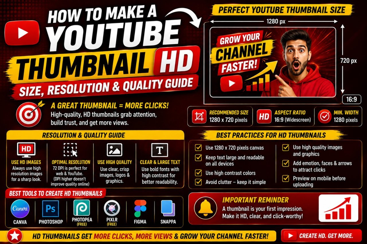
How to Make a YouTube Thumbnail HD: Size, Resolution & Quality Guide
Learn how to make a YouTube thumbnail HD with the right size, resolution, image quality, and export settings. Create sharp thumbnails without blur or pixelation.
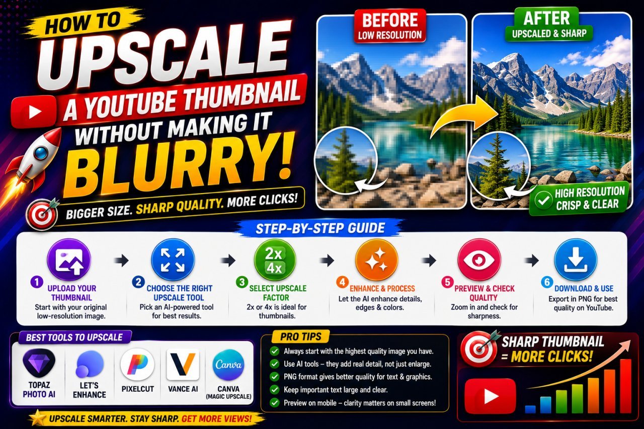
How to Upscale a YouTube Thumbnail Without Making It Blurry
Learn how to upscale a YouTube thumbnail without making it blurry. Discover the right image size, AI upscaling tips, sharpening techniques, and common mistakes to avoid.